

When western brands first infiltrated the MENA market, a majority of them made haphazard attempts to include the Arabic language into their identities. Some of them worse than others. The results ranged from vulgarly rotated and distorted logos, known as “Frankenstein Arabic”, to badly translated and unduly calligraphic symbols that should never have been inked, and didn’t fit in with the brand at all.
On the other side, a great many locally brewed brands are obsessed with “looking Arab”, in an attempt to dig in their heels—into their heritage. For a fear of losing their identity to the ‘western globalization’, they tend to focus on overly traditional imagery and calligraphy, which doesn’t leave much room for development moving forward.
Pascal Zoghbi, a master of Arabic typography and founder of 29LT, calls it as it should be—miscommunication.
“The problem in the Arab world is that they don’t know what design is. What is typography? Why do we need this? They undermine the need for a strong visual communication system,” he says. “They purely see it as a decorative element. They don’t understand the value of it as part of their identity…or that it contributes to overall society and economy.”
More than ever, he says, there is a need for a new Arab visual identity, that draws from the old and aspires to the new, seamless between the different cultures that are united by the language. It is time, he argues, that the Arab world and its stakeholders, faced with their own modernity, should embrace some serious innovation in their branding.
It starts with the script
Multiculturalism is now the norm in the region. As it blossoms with new opportunities, locals and expats alike are starting and growing their businesses here. This has given rise to a need for new and contemporary Arab identities. And it all starts with language.
“The biggest part of branding is visual communication. At the heart of communication lies language, and the core of language is script,” says Zoghbi.
“Typography is still young and misunderstood in the Arab world,” says Zoghbi. “They see it as the digital version of calligraphy. To them, it’s just a decorative element. When new businesses design their brands, they need to remember that it’s not only about aesthetics, it’s about a strategy to make society better.”
Predictably, western brands moving into the region today are paying more attention to how they integrate Arabic into their identities. “But it’s not just about the font you use,” says Pascal. “It’s important to understand culture and all its nuances.”
“Arabic isn’t only spoken in one country,” says Pascal. “It’s the official language of more than 25 countries, and is spoken everywhere the Arab diaspora finds itself. It’s the fifth most spoken language in the world.”
“The script itself is even more widely used, even in non-Arabic languages like Persian, Urdu and Pashto. After Latin and Chinese, the Arabic script is the most used in the world.”
Pascal explains that to communicate with this wide range of countries and cultures is now a business goal, and that “there is no brand in the world that can ignore the Arabic language or script anymore.”
“In the global scale of things, organizations need to speak to people in their language,” he says, adding that global communication platforms like “Google and Facebook are already creating new types of fonts to do this.”
Zoghbi would know. He often joins forces with branding, design and advertising agencies from the US, Europe and the MENA region to deliver Arabic typography solutions for corporate identities to logos.
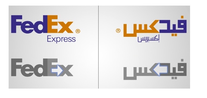
Alongside his commercial fonts, Zoghbi and his award-winning brand 29LT has created custom typefaces for Middle Eastern and international brands, including Swatch, Google, FedEx, Abu Dhabi Airport, Dubai Expo 2020, Noor Bank, East & East, Emirates, Museum of Islamic Art etc.
His fonts Noto & Droid Naskh were designed in 2010 for use in Google products like Chrome, and are the default fonts for Arabic script in smartphones using the latest Android operating system.
“It gives me huge satisfaction that my work contributes to the overall communication system,” he says.
“Fonts are the main tool for communication. People need them to write an email…to chat on WhatsApp. It’s the main brick in the wall of digital communication.”
A Fading Font-asy
In the past, all MENA agencies and publishers used to have in-house calligraphers or even a team of calligraphers. But, as with a majority of traditional art forms, technology has all but rendered them extinct. The emergence of typesetting software and fonts have replaced them all, and these skilled artisans have retreated into the art world.
“We are sadly seeing a huge decline in the number of professional calligraphers. And what people don’t realize is that we still very much need them,” Pascal urges.
“It’s all caused by a lack of calligraphy being taught in schools. Young people aren’t interested in learning the skill, and about why this important for our culture. Now it’s seen as ‘only an art’. But it used to be a giant part of our communications. And still is.”
According to Pascal, there are three schools of thought surrounding calligraphy and fonts. The first is very traditional and the other is very experimental.
The sweet spot, Pascal says, is somewhere in the middle. “One which draws from the calligraphy side of things but reinvents it to modernize it—to create a contemporary font.”
In the past there were one or two agencies in the whole region that held a monopoly on creating fonts.
But we are now seeing a wave of new fonts and type families, some custom-created, others are free.
“There are more and more script and type designers, and they’re able to self-publish them in independent type foundries,” he says. “It’s becoming much easier now to access professional Arabic fonts. So there’s really no excuse for organizations not to at least try to integrate it into their communication.”
Future Font-astic
Being a master type creator who designs Latin and Arabic fonts, Pascal ironically wasn’t always that in touch with his Arab heritage. As a school pupil in Beirut, he had terrible trouble learning Arabic.
It wasn’t until his university days where he started becoming fascinated with the script, language and history of his people.
“Lebanon isn’t as connected to the Arabic culture and heritage as other Arab nations around us,” he says. “In only the last five to 10 years there’s been a surge of a new generation of students who are more in touch with their Arabic culture,” he says.
Thankfully, the last decade has also seen an upsurge in educational institutes that support the design industry in the region. And although it’s still far from being described as ‘thriving’, this increase indicates an improvement in the regional awareness about the importance of design.
Pascal believes there are two aspects that’ll keep the momentum going: More education, and a newfound respect for the role of design in Arab society.
That in conjunction with a steady influx of international branding agencies and of course, the explosion of information, should show the regional economy’s stakeholders, including Middle Eastern governments, the importance of a contemporary Arabic identity, that is accurately communicated.
“After all, good branding is a reflection of a country that’s doing well,” says Pascal.